Case study · Greenhaus
Greenhaus
Website and booking experience design for Greenhaus, a pop-up retail concept where digitally native brands rent counter space in stores across North America.
01 — Context
A storefront for brands that started online
Greenhaus is building a pop-up store model for digitally native brands. Instead of signing a long lease, a brand rents a counter inside a Greenhaus store, sharing the space with other like-minded brands and getting a physical place to sell, meet customers and build loyalty.
As the venture took shape, Greenhaus needed a new online presence to promote it and, just as importantly, to sell it. The website had to explain the concept to brand founders, show where stores were opening and let a brand reserve a spot without a long sales process. That made this a pop-up retail website design project with a clear commercial job.
We designed the website around two key templates: a locations page and a city page with a built-in booking flow.
02 — Experience
From browsing cities to booking a counter
The locations page starts with a short introduction and a search bar, then shows each city as a card with a storefront photo, a location pin and a "Spots are limited" progress bar. That small bar does a lot of work. It tells founders how many counters remain at a glance and adds gentle urgency without a hard sell.
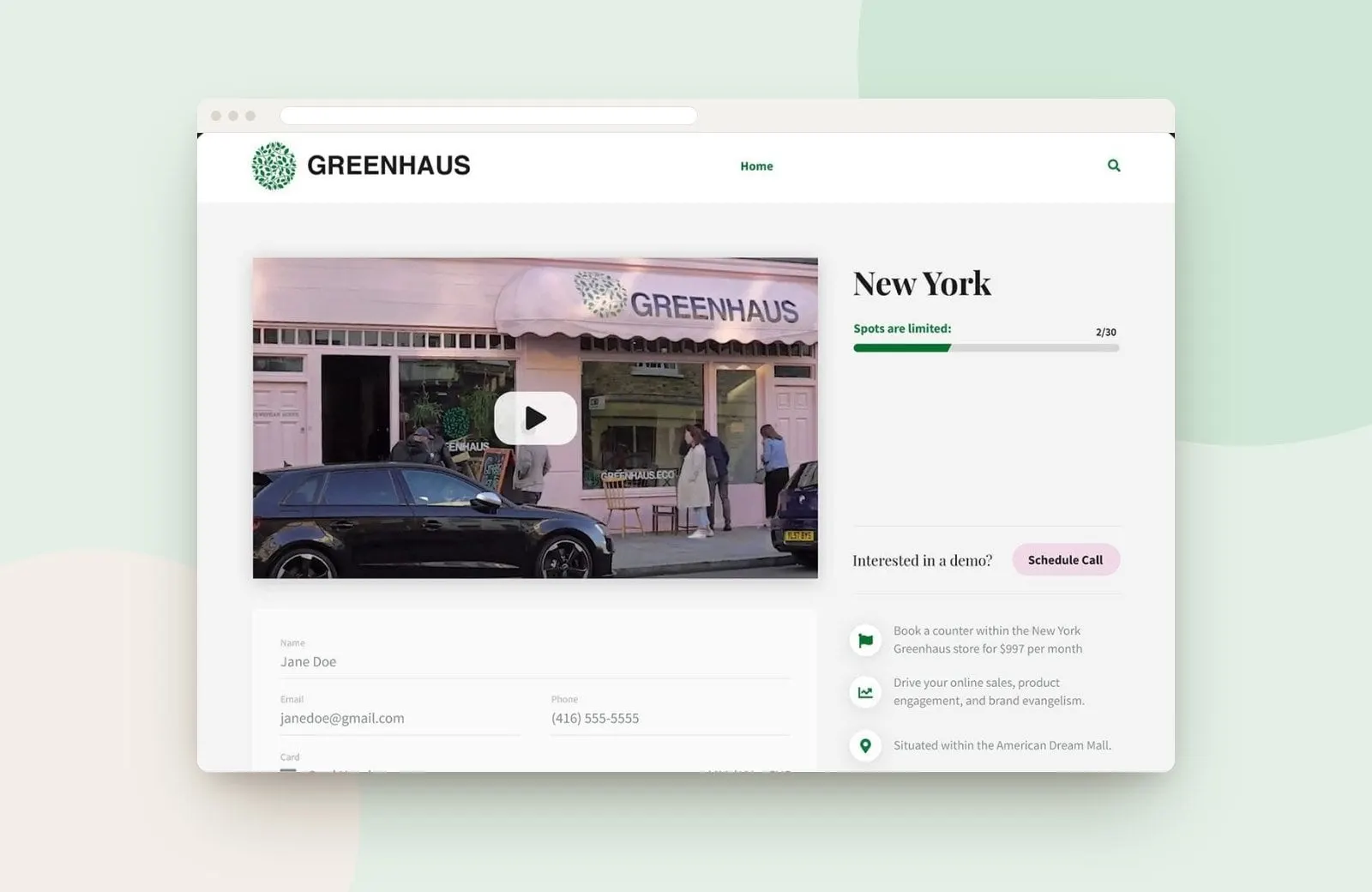
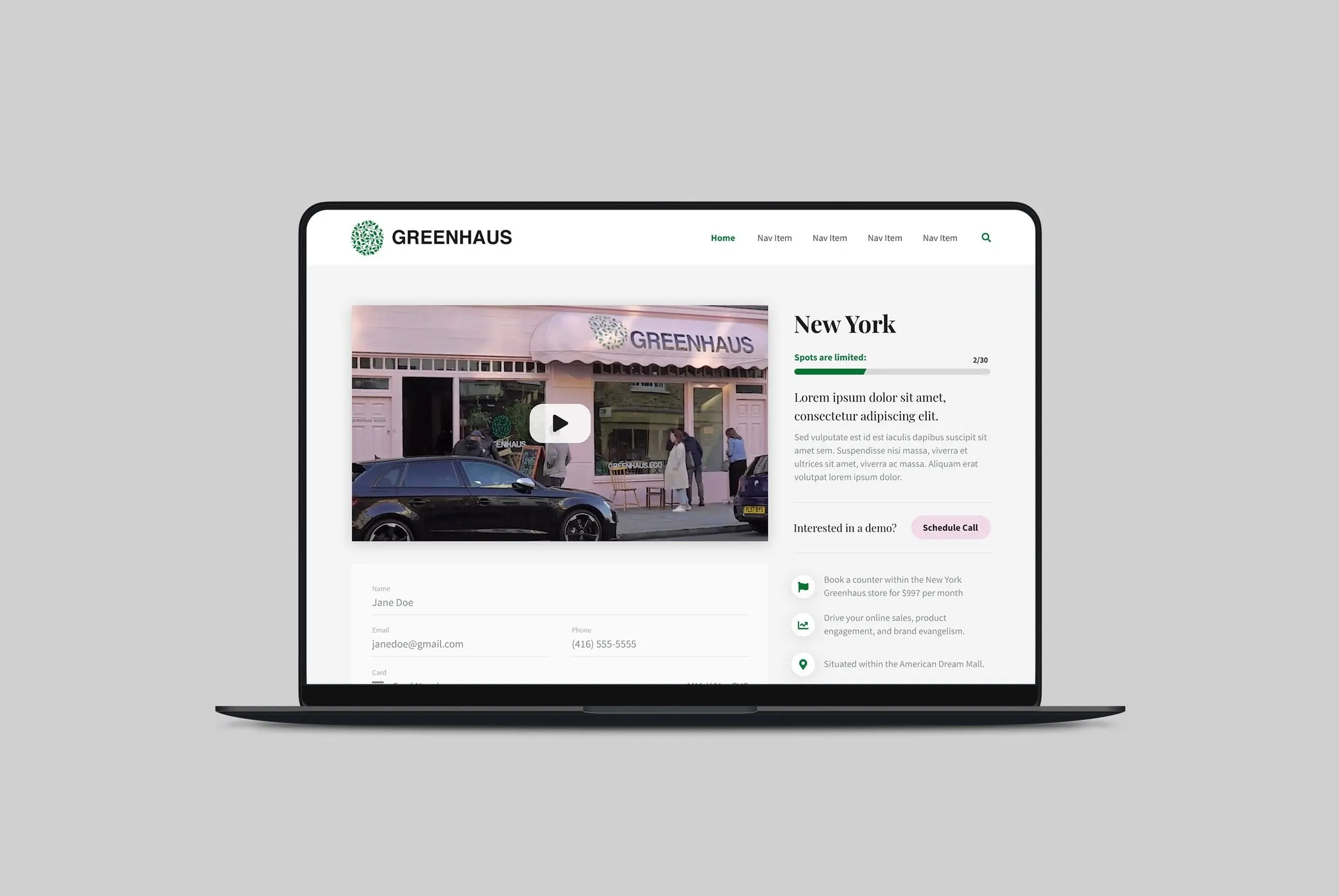
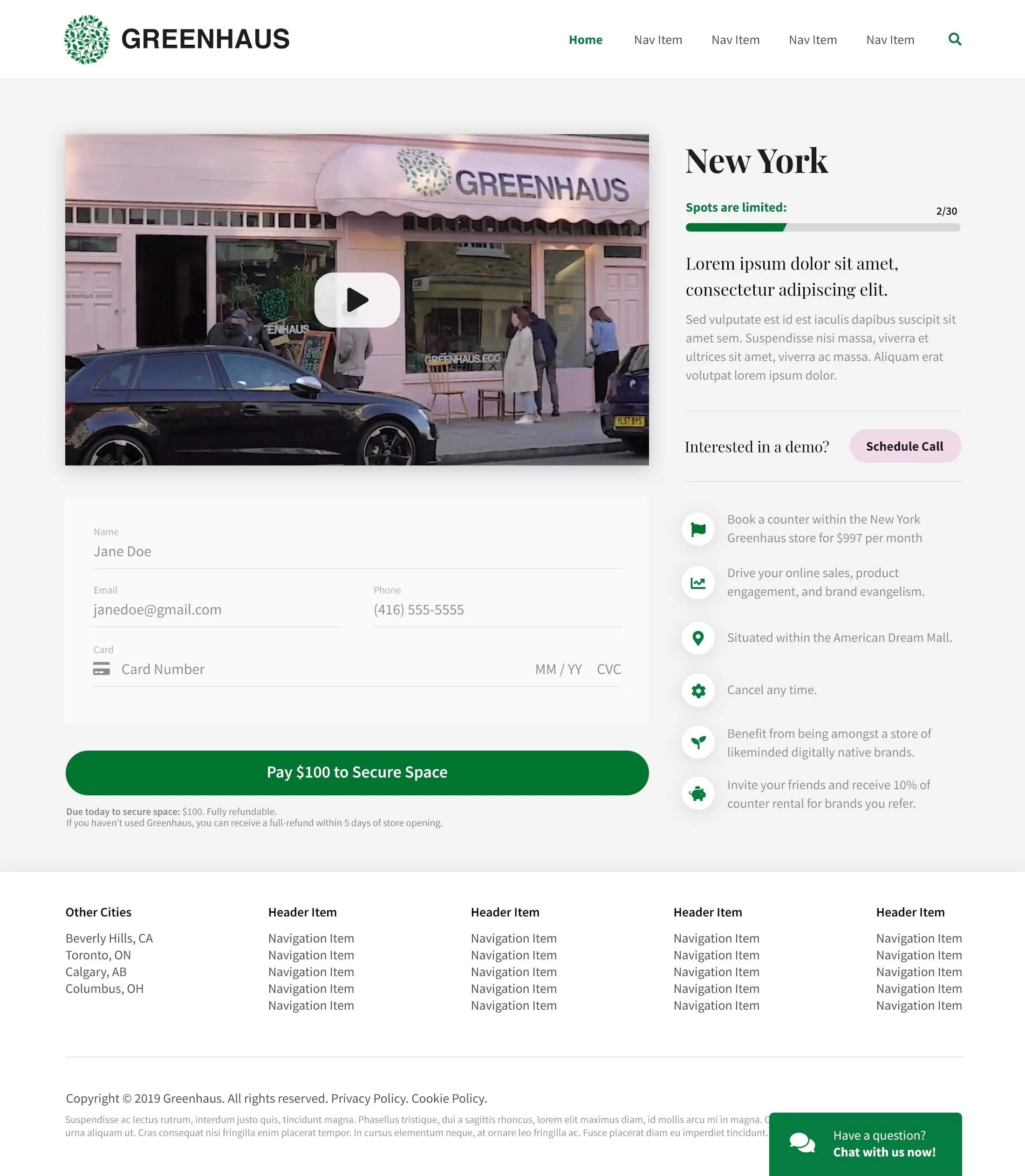
Each city page then gives a brand everything it needs to decide. A storefront video sits beside the city name and the same availability bar. A short list of benefits, each with a green icon, covers the details: counter pricing, the store's location, the ability to cancel any time and a referral offer. The New York page, for example, notes a counter within the American Dream Mall.
Below the video, a simple form collects a name, email, phone and card details, with a single green button to pay a refundable deposit to secure a space. For founders who want to talk first, a "Schedule Call" button and a chat window are always close by. Good UX and UI design here meant removing every reason to wait.
03 — Look and feel
A fresh, modern retail identity online
Visually, we let the Greenhaus logo lead. Its leafy green circle sets the main brand colour, used for the active navigation, progress bars, icons and the primary button. A soft pink accent on the Schedule Call button echoes the pink awning of the store in the video. Headlines use an elegant serif, while forms and labels use a clean sans serif so the booking steps stay easy to read.
The footer lists other cities, including Beverly Hills, Toronto, Calgary and Columbus, which lets the template scale as new stores open. Each new city just needs a photo, a video and its details.
For more work with startups and emerging brands, see the website we designed for Lapa Lopa, or read about how great design moves people to action.
What we delivered
A website and booking experience for the Greenhaus pop-up model.