Case study · Green Terra Solutions
Green Terra Solutions
Ground-up branding, business cards and a website for Green Terra Solutions, a Charleston, SC company bringing food-waste composting to industrial manufacturers.
01 — Context
Sustainability branding from the ground up
Green Terra Solutions creates and implements greener solutions for America's industrial manufacturers, with a focus on composting food waste. Its owners, Vanessa and Amanda, run the business from Charleston, South Carolina, and came to us for a brand built from the ground up.
They wanted sustainability branding that reflected their mission, vision and values — something that showed their commitment to sustainable practices in industrial manufacturing, and that would speak to manufacturers as clearly as it speaks to anyone who cares about where food waste ends up. We supported them across every part of the brand and its digital presence.
The balance we were looking for: earthy and optimistic, but credible enough for a business-to-business conversation about waste disposal.
02 — Identity
Leaves, soil and a friendly serif
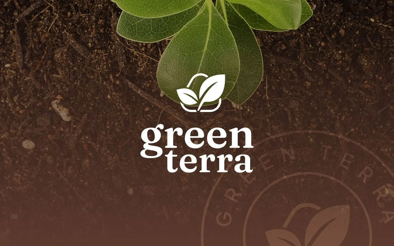
Composting turns waste into something that grows. The Green Terra symbol shows exactly that: two leaves emerging from a soft, rounded container shape. It is simple enough to read at small sizes and specific enough to belong to a composting company rather than any "green" brand.
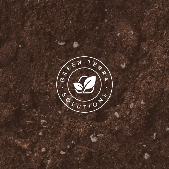
We set the name in a warm, rounded serif in lowercase, stacking "green" over "terra" so the wordmark feels approachable rather than corporate. Two supporting marks extend the system: a lowercase g monogram sprouting two leaves, for social profiles and small applications, and a circular badge that wraps GREEN TERRA SOLUTIONS around the symbol, for stamps, stickers and backgrounds.
Colour and imagery come straight from the subject. A fresh, saturated green carries the brand, while rich photography of dark soil and compost gives it depth — a reminder that the product is real, physical and useful.

03 — Print & web
Business cards and a website that explain composting
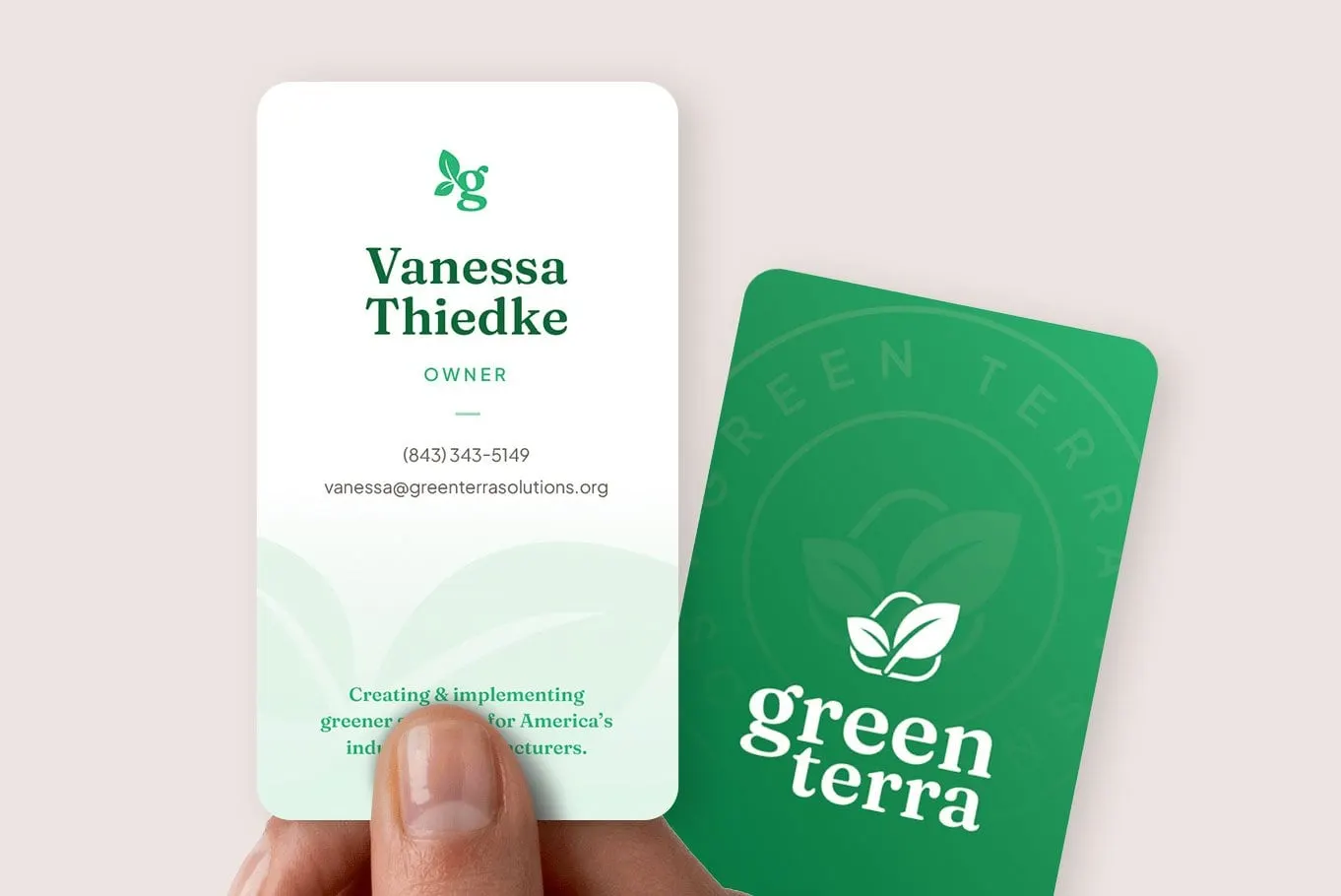
For print, we designed rounded-corner, vertical business cards. The front is clean white with the monogram, owner details and a soft leaf watermark, closing with the line "Creating & implementing greener solutions for America's industrial manufacturers." The back is solid green with the reversed logo over a faint badge pattern.
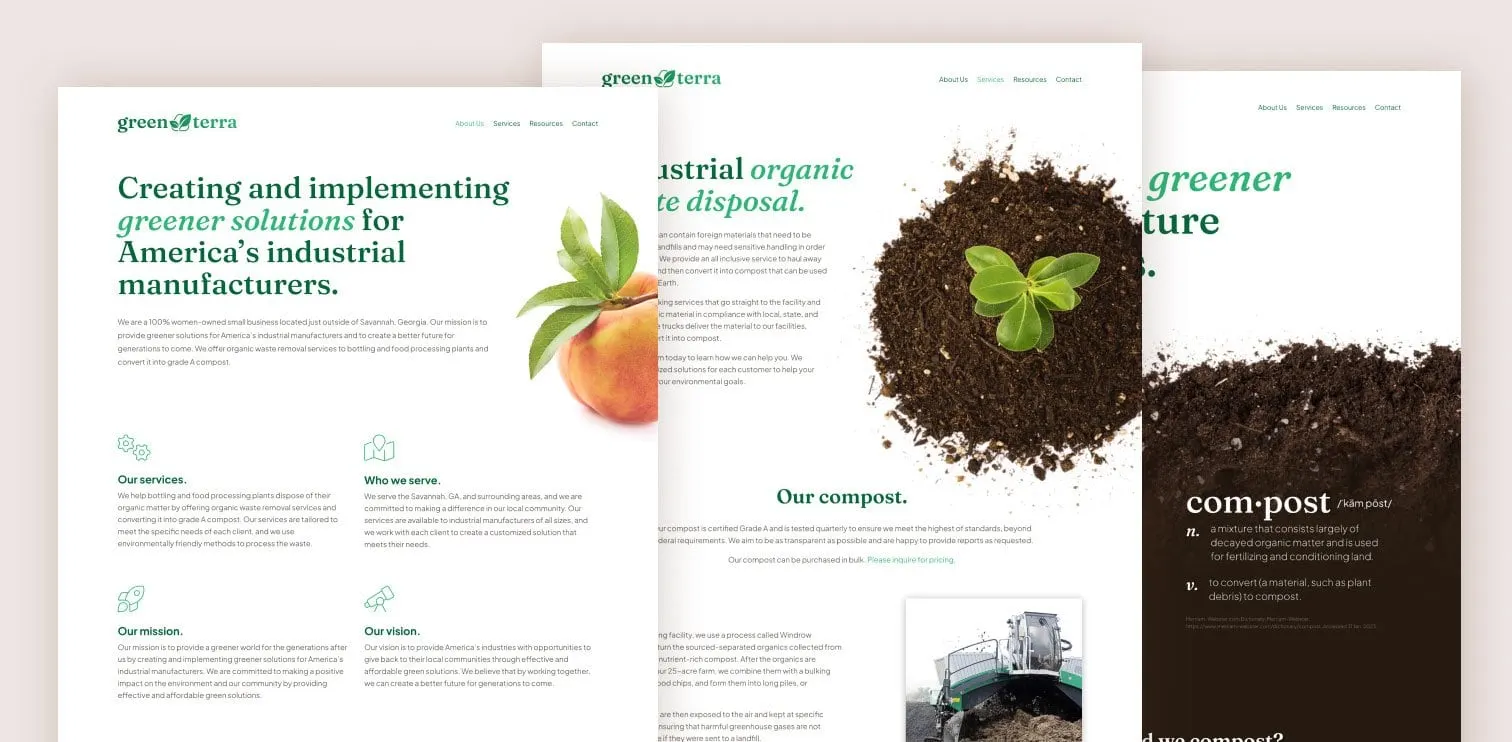
The website design picks up the same line as its homepage headline, with "greener solutions" in italic green. Below it, four short sections introduce Our services, Who we serve, Our mission and Our vision, each with a simple line icon. Inner pages cover industrial organic waste disposal and Green Terra's compost, using large cut-out photographs of soil, seedlings and fruit on white, and even a dictionary-style definition of "com·post" to make an unfamiliar service easy to understand.
Because the identity and website were designed together, the site launched with the brand fully formed — an approach we explain in why branding and web design should happen together.
04 — The result
A brand ready for its first conversations
Green Terra Solutions now has a complete, consistent identity to bring to manufacturers: a memorable symbol, flexible supporting marks, business cards to hand over in person and a website that explains the service clearly.
We enjoy helping startups and emerging brands launch with a brand that matches their ambition. For another identity and website built together, see our work for Kauri Chiropractic.
What we delivered
A complete brand and digital presence for Green Terra Solutions.