Case study · Chamboulé
Chamboulé
A story-led website for Chamboulé, a Northern California winery, giving its coastal vineyards, Merroir philosophy and founders' stories room to breathe.
01 — Context
A winery with a story to tell
Chamboulé is a winery and vineyard project on the coast of Northern California, born from a partnership between two winemakers, Francois Morissette and Matt Taylor. Its vineyards sit near the small town of Occidental, and its whole approach is shaped by the nearby Pacific Ocean.
The winery needed a polished web presence that could explain its methods, its farming practices and the wine it makes. This was not a case for a standard shop-first template. Chamboulé's wines are about place and people, and the site had to give those stories room. That meant winery website design that reads more like a beautiful magazine than a product catalogue.
We designed the site as a series of editorial pages, each built around large photography, generous white space and long-form writing.
02 — Design
Turning a winery website upside down
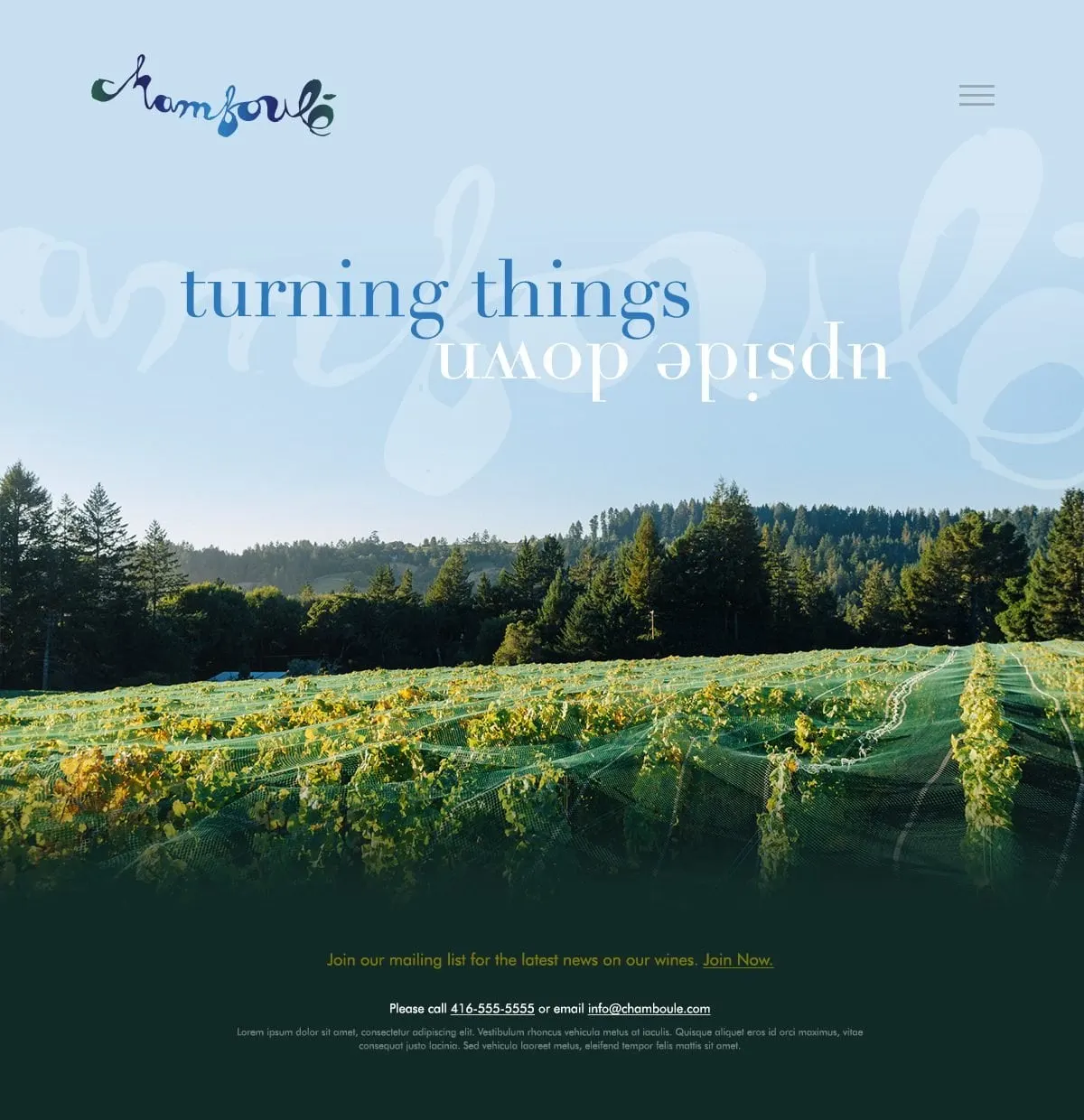
The name Chamboulé suggests something turned upside down, so we took that literally on the landing page. The headline "turning things upside down" flips its second line, set in an elegant high-contrast serif in Chamboulé blue. Behind it, the hand-drawn script logo floats as a large, faded watermark. Below, a full-width photo of netted vineyard rows and dark forest grounds the page in a real place, followed by a simple invitation to join the mailing list.
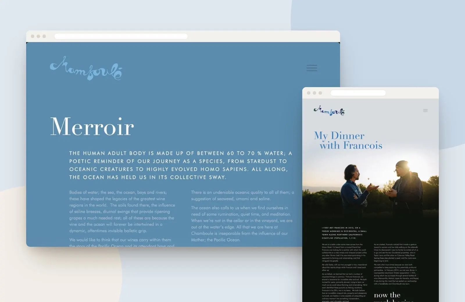
Colour follows the land and the sea. Sky blue and soft grey open the pages, ocean blue carries the Merroir story, and deep greens and charcoals take over as visitors scroll into the long reads. Spaced, all-caps introductions lead into two-column body text, a classic editorial rhythm that makes long stories comfortable to read.
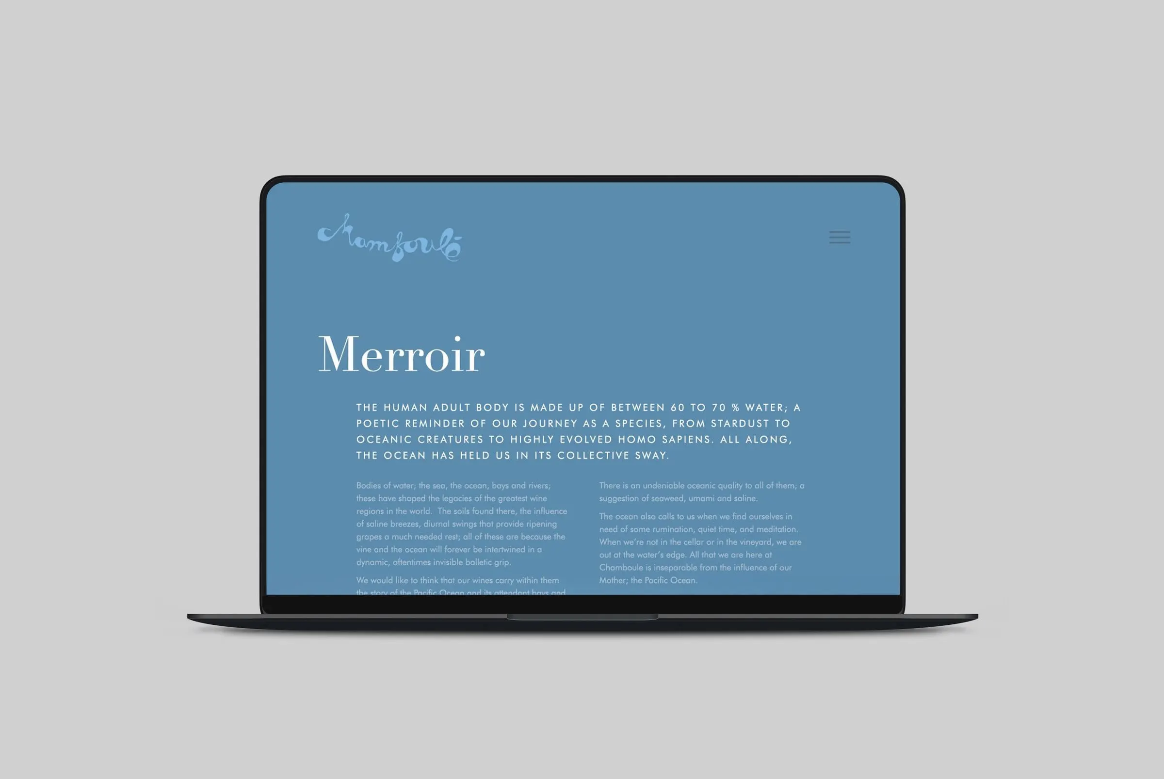
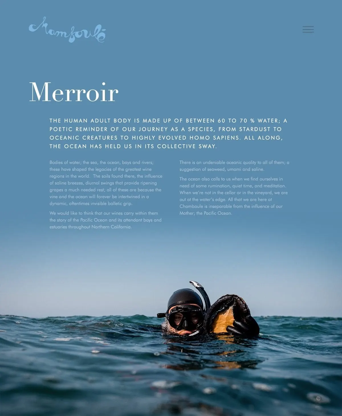
The Merroir page explains the winery's philosophy: that the ocean shapes the vineyard as much as the soil does. We set it on a full ocean-blue background that fades into a photo of a diver holding seaweed at the surface, so the idea is felt before it is read. It is a good example of why a website should make people feel something.
03 — People
Letting the founders tell it themselves
Wine buyers want to know who makes the wine. Chamboulé's founders have unusual, wide-ranging stories, and we designed pages that let them unfold at their own pace.
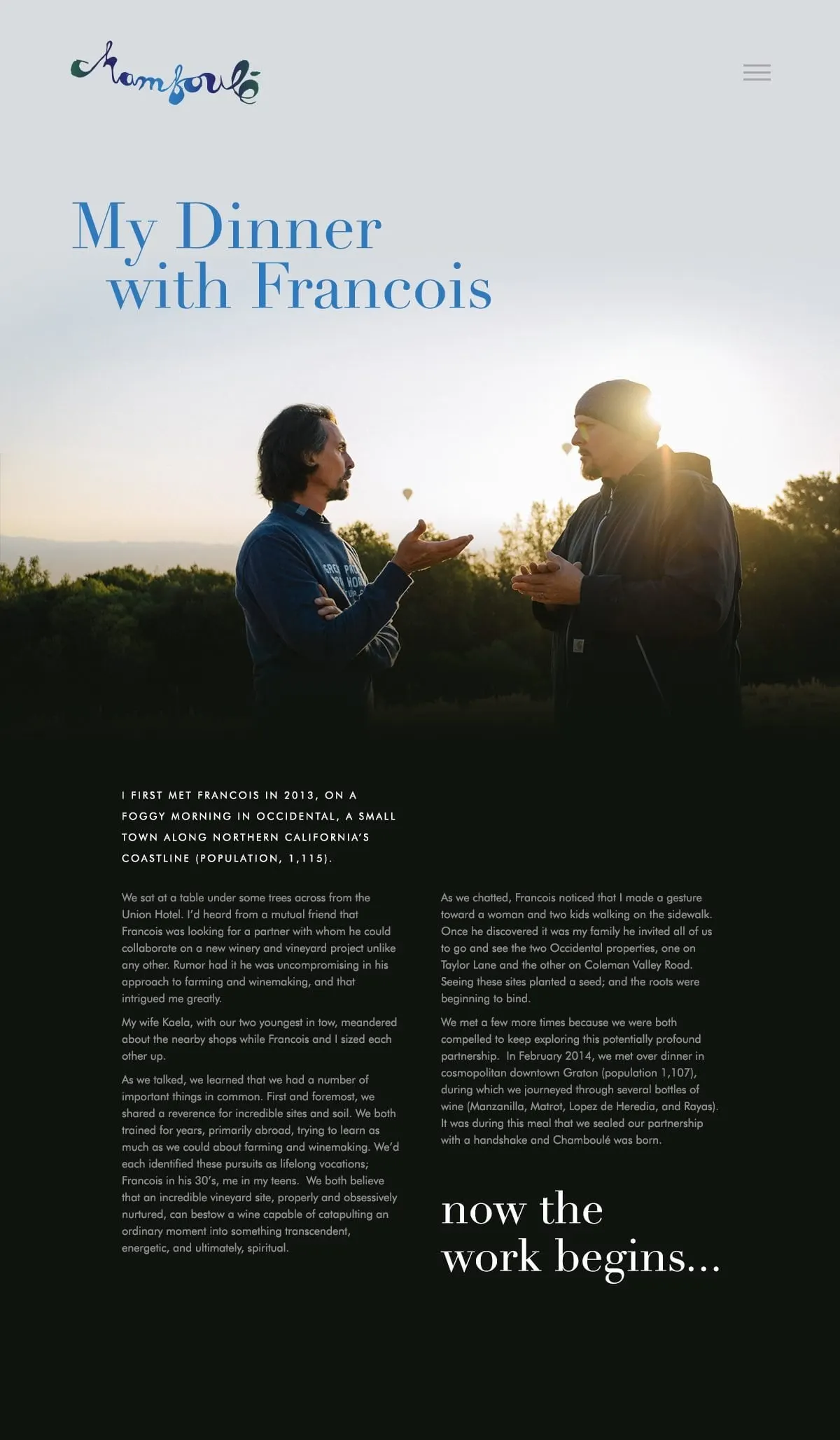
"My Dinner with Francois" tells how the partnership began, from a first meeting in Occidental to the dinner where it was sealed with a handshake. A large serif headline sits above a sunrise portrait of the two winemakers, and the page closes on the line "now the work begins..."
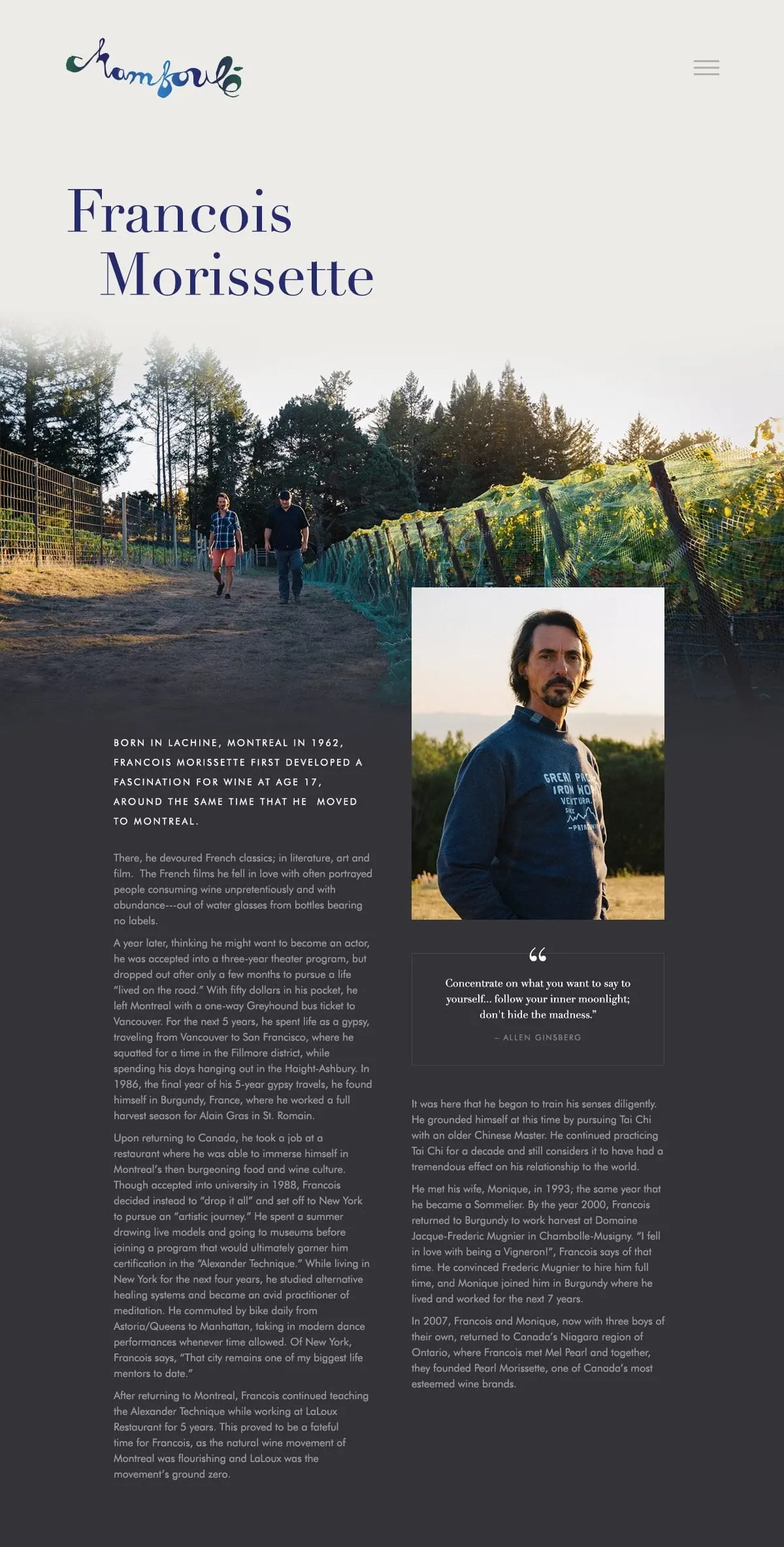
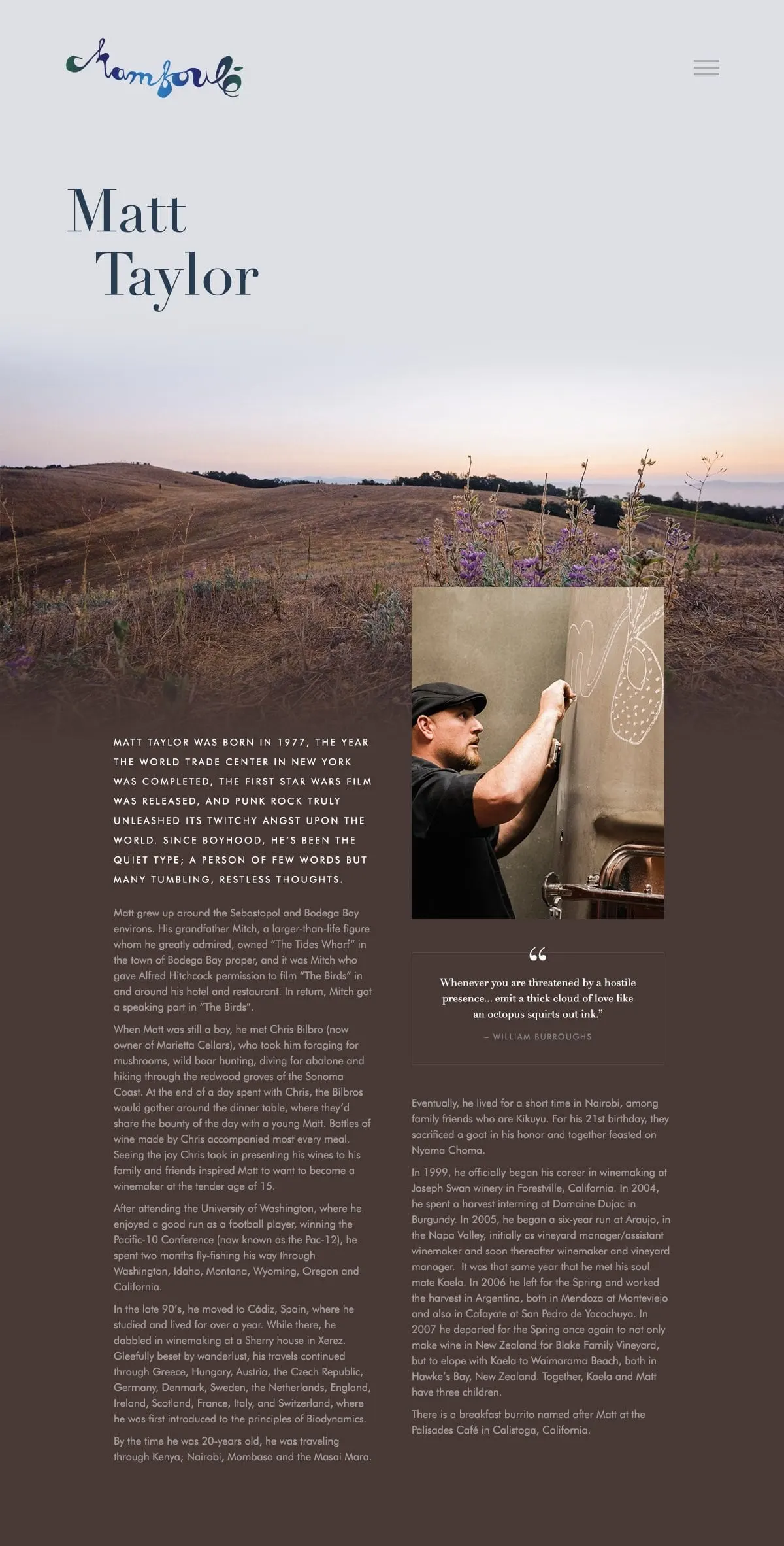
Each founder also has a profile page. Francois Morissette's and Matt Taylor's names are set in oversized serif type over landscape photography, followed by a portrait, a long biography in two columns and a framed pull quote. The layouts share the same structure but change colour and imagery to suit each person.
This kind of website design works for any food and beverage brand whose product depends on its origin story. For another grower's web presence, see our work for Grills Orchards, and you can read more about storytelling through web design on our blog.
What we delivered
An editorial website for a Northern California winery.